Monday, 11 November 2013

Stage 5 Analysis

   I decided to try and develop my idea of combining my drawing with my photographs, the repetition work on ice inspired by Jeffrey Simmons worked very effectively but I felt I needed a guide such as Simmon's rotational devices so I had more control over the image rather than just repetition of lines as I was doing before. I decided to use a compass and spirograph; although the compass paintings were effective I felt the circular shape did not connect with the work I had previously been making and the spirograph images were too floral like and had been used so many times in art already, I need to come up with a more original idea.


      I decided that in my high end collection I would offer wall murals as I think some of my photographs are interesting compositionally on their own. I made visualisations to represent the settings for these which are aimed at my audience of home owners; so I have chosen interior settings which have a colour scheme to match my designs. This is important when companies are selling their designs because they are trying to sell a style to the audience, not just a wall mural design. It is important for me to look back on my past designs and put these into visualisations so the audience could see what scale the prints are in context to a room. 


     I have decided I need to edit my CV and make a creative one that is more appropriate for the jobs I will be applying for. I went to a CV workshop and this was useful in what to write on my CV but I felt I needed to do research into how to design it.  http://www.hongkiat.com/blog/creative-designer-resume-curriculum-vitae/ was very useful for my research.  I feel the design is simple enough for people to clearly understand what I am about.


Monday, 4 November 2013

Stage 4 Analysis

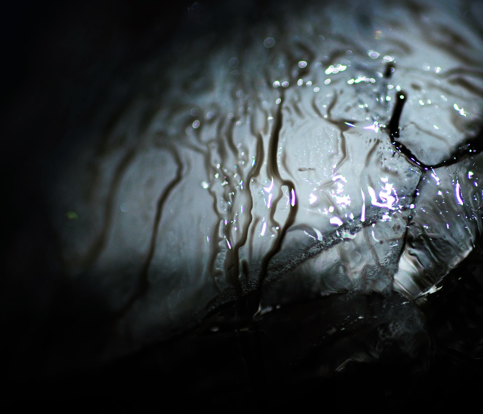
After studying my ice photographs I observed that some had a layout like a landscape, so I decided to use two projectors and layer my photographs to create a landscape view similar to sublime paintings. These worked effectively but were too busy once projected onto the 3D forms. I could use the photos of the two projections taken against the wall when creating my design collection, although the photos didn't look like landscapes because of the detail, they still created striking images.


     I felt that it was important to start creating my design collection so I could use the ideas and samples I had already created and develop these further. I decided that I would make two separate collections as the images and colours in my photography would not suit a mid market range, so these will be used for my high end collection. I will pick certain colours from my photography to create colour ways for my mid market range. I still want the two collections to have elements which are similar, this will be developed when creating the two collections.
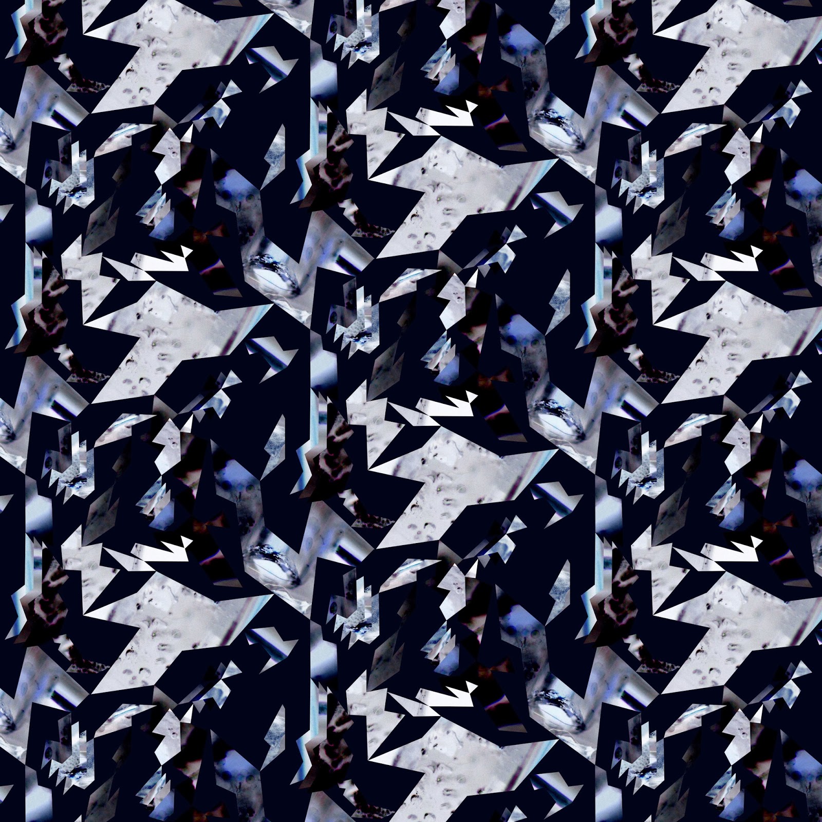
     The first designs I created for my high end collection were inspired by my hand made cut out 'glitches', I used the shapes from the photos to link with the past samples I have created. I used a half drop repeat design as I thought this would create more of a flow to my designs. I was unhappy with my first design as the shapes look mechanical. I decided I needed the shapes to be more uniform as in my hand made cut out 'glitches' so there is some order within the disorder.


     I think my next two designs worked much better and I managed to keep the mood within my designs. 


I decided to take inspiration from Piia Podersalu's design and create mirrored designs as I thought this would work well with my idea of mirroring the ice. These designs are effective and work well with the designs I have done above because the colours and textures complement each other.

Podersalu, P. Tie- dye. Piia Podersalu. [Online image] [Accessed on 03/10/2013] http://www.piiapodersalu.com/Pattern


Monday, 28 October 2013

Stage 3 Analysis


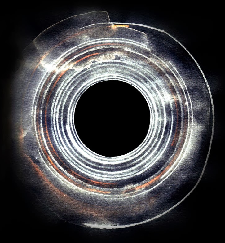
     Jeffrey Simmons creates unique watercolour paintings using mapped drawings and rotation devices. http://www.jeffreysimmonsstudio.com/ I was drawn to his intense use of colour and the impression of motion and depth, these are things I aim to create in my work. His planned drawings reminded me of my plans for my 3D forms, so I decided I wanted to explore another aspect of his work, repetition. Using dyes and inks on a sheet of ice I explored using the square ends of match sticks to draw continuous lines. I found the outcome to be eerie, with qualities of Jeffrey Simmons work, having sections of intense colour and sections of bleakness.
     As my photographs have been successful I have decided to create a photography book including a collection of my best photographs over the Practice project to help promote myself as a designer; I will begin this near the end of the project when I feel content about my collection of photographs and I have finished experimenting with ice photography.

Jeffrey Simmons. Preparatory drawing for watercolour painting. [Online image] [Accessed 22 October 2013] http://jeffreysimmons.tumblr.com/

Jeffrey Simmons. Works on paper. [Online image] [Accessed 22 October 2013] http://www.jeffreysimmonsstudio.com/


     As part of my development between my 3D forms and photography I decided to create larger scale 3D forms and project my photographs onto them so they had more surface to sit on and the audience could clearly see the detail in them. I tested using both clean white paper for my 3D forms and also some where you could see the drawn plans. The projections where you could see the drawn plans didn't work as well because the lines took away from the detail of the photographs. I decided to edit some photographs so the images blended into the drawn plans, I thought these worked effectively and had drawn qualities about them, therefore I would like to try and combine some of my drawings with my photography when I am creating my design collection.


Monday, 21 October 2013

Live Project- Homebase Wallpaper Competition

As part of my live project I decided to do a Homebase Wallpaper competition as it is important to practice working to a brief, follow screen printing production colour constraints and consider scale of image, to create commercial designs because I want to work for print design companies.
     The brief was to create a design for one of their existing collections. I started contextual research looking at Graham & Brown's designs and other mid market wallpaper companies. I decided I wanted to create an animal wallpaper design for their Anthology collection using illustrations from old Darwin style books and in the shape of the motif below by Julien MacDonald, giving old fashioned images a modern twist. This was an ambitious design for me to create as I have never worked with figurative imagery before.


Julien MacDonald. Glimmerous. [Online image][Accessed 18 October 2013] http://www.homeflairdecor.co.uk/brands-16/graham-brown/designer-80/fabulous-by-julien-macdonald


Monday, 14 October 2013

Stage 2 Analysis

     My 3D paper forms worked so well I wanted to develop this idea further. I took these plans back to their 2D form; as its end purpose is to become a flat print; transferring the patterns from my photographs of my 3D shapes and cutting these out of my ice photographs to combine the two together. I reorganised my cut outs on paper to have an idea of what they would look like as prints. I decided to create my designs on A2 paper so I could get an idea of the scale my photographs will work at when designing my collection.
     With the first design I decided not to cut up some larger sections of the photograph so the audience can see the mark making qualities more easily and also helps to distort the scale of the image in contrast to the smaller pieces.


     My first design was so disordered that I decided to look back at my photographs of my 3D designs, taking the shapes from them again and creating designs with slight 'glitches' in. I felt like my project was now impelled by architecture because of the 3D and drawn plans I had been working with but transferring my designs onto graph paper made them look too busy and took the attention away from my dark moody photography.


     The use of light and dark in my designs works well, but I think the last two designs I created look too ordered, whereas my first design holds an order within the disorder, something I was aiming to create. This is a process I can use in the future when I start to create my print collection. 
     I wanted to find other ways of creating 'glitches' in my images and was recommended the book 'Uncreative Writing' by Kennith Goldsmith, as there is a section to link Jpeg images and text files to create altered images. I tested this on my ice photographs and inserted text from Edmund Burke's book on the sublime, but new computers won't open up the altered Jpeg image as the computer reads it as corrupt. 
     Cecile Dachary's media explorations inspired me to create paintings using ice. I was interested in her mixture of painted textures and pin prick marks. I decided to use glitter paper as I thought the reflections off the glitter mixed with the darkness of the black ink would help create a confused and disordered image. 

   Dachary, C. Painting. Erin Louise. [Online image] [Accessed on 10 October 2013] http://erinlouise.com/2012/06/cecile-dachary/


     My photography work with ice has worked effectively and creates the dark, confused mood that I want so I will explore this further. I also want to further develop the relationship between my 3D forms and my ice photography by projecting my photographs onto larger scale 3D forms. 


Monday, 7 October 2013

Practice Project- Stage 1 Analysis

     I started my project by focusing on how I could incorporate imagery of the sublime in landscapes into interior print design. This could prove difficult as sublime paintings are bold and dark, more suited to a high end market, and I want to create a mid market range because when I leave University I want to work for a mid market design company. Since realising this I have decided to focus on incorporating the concepts of the sublime, such as the contrast of colour and abstract imagery, into interiors.
     Cliff Briggie creates transient art and examines how different liquids affect each other. This inspired me to develop his processes of experimental drawing for my visual research using photography. http://www.cliffbriggie.com/

     Briggie,C. Ice Paintings. We are star stuff. [Online image] [Accessed 11 October 2013] http://we-are-star-stuff.tumblr.com/post/57557859589/ice-paintings-by-cliff-briggie

     I experimented with the same mediums as Cliff Briggie when starting to create my visual research; plus others such as foil, video tape and beads as it is important to make my work distinct from Briggie's  and learn how other mediums affect the outcome. The photos using paint and ice were very successful after being edited as they create a sense of other worldliness.


      I decided to use a macro mirror and use the reflections of the ice to take photographs as I thought this could add another depth to the image. The macro mirror curves and so distorts the image of the ice, creating an impression of size and movement.


      Justin Windle is a creative technologist for Google, his website Soul wire http://www.soulwire.co.uk/ uses interactive parts and mixes art, science and technology.  I tested out the Glitch Generator as it alters the bytes in your images, stimulating digital interference. This idea works well with the sublime as they both create confused uncertain images. 


     Using the Glitch Generator you can alter the glitch amount, iterations and the speed but I wish to create my own 'glitches'. I am inspired by sculpture and 3 dimensional forms so I started looking at a design book 'Folding Techniques for Designers from Sheet to Form' by Paul Jackson. I used some of these techniques on my photographs trying to create 'glitches' with each fold. After photographing the 3 dimensional forms I didn't find them stimulating, so I decided to turn the designs over and photograph them from different angles. Seeing my drawn plans on the back against the white folds created other patterns which were not visible before. I want to take this idea further and try combining it with my ideas of the sublime. 


     For my live project I have contacted Graham & Brown as I did an internship with them in August 2013 and thought it would strengthen my connections with them. I will engage with a project set by Paula Taylor, Trend and colour specialist at Graham & Brown. After two weeks I will go to their design studio and present my work to the design team which will help me understand what it will be like to present in the art industry and will also help with confidence when going for job interviews.     
     
Ways I will communicate and promote myself as a designer throughout the project:


Friday, 30 August 2013

Graham & Brown Internship

     I learnt a lot while working within the design studio at Graham & Brown as it was a more professionally run company than Mirjam Rouden. The staff were all eager to help me get the best possible experience, the trend and colour specialist set me a project to do and I also had a tour of the factory where all of Graham & Brown wallpapers are produced and shipped.
     In the design studio there were mood boards and samples of wallpaper everywhere, it was a very inspirational and lively place to work. On my first day I was given the option of five different themes, which they had mood boards on to give you initial ideas. As I was told to design for flat wallpaper I chose to work on the theme minerals as I thought I could create textured prints on a flat surface.
     I started by doing research in the books and magazines and created a mood board. This helped me create visual research which I then scanned in and worked into on Photoshop. For a flat wallpaper they use the measurements 52 by 53 cm. Halfway through creating my designs I got some of the designers to take a look at my work, they were impressed but said I needed to give more colour options for a more commercial look.
     On my last day they gave me the option of creating a look book, with all my samples and colour options, as if I was putting my collection together to sell. I also created some visualizations as customers like to see what the wallpaper looks like in a room. I created two books, one for me and one for the company to keep. At the end of the day I did a presentation to half of the design staff on my project, they all understood my idea very well and continued by asking questions afterwards which I managed to answer confidently.

Statement print I designed for my mineral collection.

Commercialized print I designed.

     I learnt a lot on the tour of the factory; while I was designing I was in close contact with the people working in the sampling production line. There is a close connection between the designers and production for the correct print; speed and accuracy are incredibly important to such a large company, especially in sampling as all the samples must be the same before putting into production. It can take months of sampling before a design is put into production. 
     I learnt that before the samples can be put onto screens each colour has to be separated on CAD and then put onto separate screens. These will be acetate screens and the holes in the screens can be different sizes depending on the printing material, a glittery ink would need large holes for the glitter to do through whereas a plain thin paint would need smaller holes. There are a large number of screens in production in one time and all master samples (final samples which have been produced) are kept in a library and on a computer system, all information on production is kept for reproduction. 
     When companies ask for a certain design creating they all may also ask for a certain colour and give a reference, such as a certain colour on a package. In the sampling room they have a light box which has the effects of different light, such as day light, UV light, indoor light so they can see the differences these lights make to the colours on the samples. If the colours don't match they will start again until the colours match in all lights. When people apply for a job at Graham & Brown they have to complete a colour mix test to show they can recognize different shades in colour.   
     In the factory they have single and double width machines, at the end of the production line the double width paper will be cut in half by a spinning blade. The single width machine creates 120 meters a minute of wallpaper. They have double headed machines which can do two jobs one after another as the screens can swap round once the first screen has finished printing. They use a computer to calculate the measurements for paint in a full roll, any left over is re used. The company is very sustainable, every tree they cut down, they plant one or three more, each one in Europe; even the glue used on the cardboard boxes is biodegradable.  

Statement print I designed for my mineral collection.

Statement print I designed.