I feel that my understanding of the context for my work has increased greatly during this project, taking into consideration use of colour, size and imagery in production processes. I understand better how the audience influences colour palette and imagery. My work has developed to a more professional standard with my use of the combination of different digital programmes. The professionalism of my presentation has improved with research into designers/ artists use of presentation in different media and the use of InDesign which I hadn't used before. I was ambitious with the aims of my project as I had never designed a floral print before and I have now designed a floral collection suitable to be sold within a wallpaper company.
I feel I have used social media to promote myself as a designer successfully, becoming a top contributor in Linkedin, receiving two awards on ViewBug and increasing followers on my blog. For Unit X I plan to create a digital wallpaper collection for paper.
Showing posts with label Self Evaluation. Show all posts
Showing posts with label Self Evaluation. Show all posts
Friday, 21 February 2014
Thursday, 16 May 2013
Stage 5- Final Stage
After evaluating the beginning stages of the development of my collection, I have taken into consideration that my final prints need to be a bedding set size once in repeat. I did research into the measurements of a double bedding set; which is 200cm by 200cm, I now always work to these specific measurements when putting my designs in repeat as would a bedding designer. I made sure that my previous designs don't distort or pixelate once in the correct measurements, I then altered them to these. Through this I learnt that I should always research the measurements I need to work to before starting to design.
Through my research I found that bedding designs at the moment are very busy and colourful and the colour scheme I had chosen was very bright and vibrant, I think this was successful. I also noticed that a lot of the engineered designs were very large; taking into account the parts of the design that would come off the edge of the bed. Through the evaluation of my recent designs I knew I needed to take this into consideration when creating my final collection. This is one design I created that I made the boarders larger, taking into account the bedding hanging over the edges of the bed.

During the past analysis of my recent designs I found that I wasn't challenging myself enough with the types of patterns I was creating, so I decided to do this so visually my final collection would be more varied. I think this was integral to my learning process and I now have a better understanding of different patterns. In the development of my final collection I incorporated mirror repeat, half drop repeat, block repeat and engineered prints. Even though I have not included all of these into my final collection I can show through my development I have a very good understanding of each of these.

Mirror repeat- part of development.

Half drop repeat- part of development.

Block repeat- part of development.

Engineered and mirror repeat- part of development.
I did research into how they would be printed if they went into manufacture. I already knew my designs would be digitally printed as they are so detailed and would be produced many times. But I also did research into what dyes would be used and which colour model would be used, such as RGB, CYMK or Lab colour. I found that reactive dye is usually used in digital printing as you can achieve brighter colours with these. I also studied which colour model would work best with my designs and I found that RGB would be the best as it doesn't distort the colour which is important that it is vivid.


An example of a colour model test- top is RGB, bottom is CYMK. CYMK distorts the colour whereas RGB is bright and vivid like original design.
I did research into what fabrics are used in bedding so I could have swatches of what fabric my designs could be put onto. I found that Polycotton Percale, Polyester IFR, Cotton, Waffle Cotton, Egyptian Cotton, Cotton Percale, and for a more lustrous feel, silk. I then did research into which fabrics take dye best as it is important to me that the colours are vivid. I decided that the fabric I would use for my bedding would be Cotton Percale, as I feel that it would be more appropriate for bedding than just plain cotton as it is a little stiffer but still as soft; and Silk/ Viscose satin, as I wanted a more extravagant material than Cotton Percale but with the mix of Silk with Viscose it wouldn't be as slippery on the bed as plain Silk. I found this information very important to my learning process as I know I will have to know these things when I am designing patterns for a company, as information like colour models and fabric can affect your design and the production and popularity of it once in stores.
During the evaluation of my previous designs I decided I wanted my designs to feel more organic like the images of earth from space, this was inspired by the piece by tactile wonderland which looks very space- like and ordered but is also organic looking with its textures. This is what I aimed for with my designs and I think I achieved due to the detail I pay to different textures, how my colour choices accentuate this; and the overlapping of some images making it feel more natural.

An image taken from space of earth showing natural growth and textures.

Tactile Wonderland.


One of my designs with a more natural feel of growth, created by using different tones and textures.
For my final collection I chose six designs, they are all very different images but link together as a collection due to the colour scheme. I felt at first that I didn't have enough designs in my collection as I had created so many designs during my development stages, but I feel that each of my designs are of good enough quality to be printed onto bedding and this is the most important factor. To present my designs I have printed my two main designs onto A1 paper as all furnishing designs are printed onto either A0 or A1 paper. To show my designs to a professional standard I have printed a piece showing each over- all design, so you can see the repeat and how it would appear on the bedding set. I have also printed out a scale piece of each print so you can see how it would appear on the bedding and appreciate the textures, scale and colour. For my two main designs I have also created a visualisation to show how each would appear on a bedding set, with pillows and an underside of the duvet cover. On the Diane Harrison studio visit I noticed how the designers there created visualisations, with a simple birds eye view of the bed showing the top of the duvet cover as a square and the pillow cases at the top as two rectangles and a triangle in the corner of the duvet cover representing the underside of the duvet cover. I chose to use this idea in my representations and I think they look simple but professional.


My two main designs in visualisations and scaled images A1 size.


The rest of my final collection.
To prepare for my presentation I have evaluated how well my presentation went during the interim assessment with the designer from Diane Harrison, I found that the designer wanted a faster overview of my development ideas, so I know for my final presentation I will have to edit some of my ideas out to keep them interested. They also liked to ask questions about my ideas so I need to make sure I am prepared for this. At the end of the presentation I will ask the designer if they have any more questions as this will show I have confidence in my designs and am happy to talk about them in a professional manner. For my presentation I want to give the designers a brief overview of my development and ideas taken from the theme we had given from them, giving them chance to ask questions at this stage, and then present to them my final collection, showing my understanding of the professional industry such as measurements, types of pattern, fabric, colour, images used and contextual research.
Overall I have learnt a lot during this project, it has helped my understanding of the interior industry and presenting my work to a professional audience. I have learnt more about the production side of furnishing such as colour models, fabric and dyes but also the design side such as taking into account measurements, how visualisations are an important part of the design process; and challenging myself to learn different types of pattern and ways to create visual research. I learnt a lot about how professional designers work within a design company during the Diane Harrison studio visit, such as programmes they use and different ways of creating prints such as by hand instead of digitally, I will definitely use this process in future. I believe that my presentation skills on a professional level have improved due to this project as I have learnt how to give a brief overview on the most important factors and talk about professional factors affecting my work and develop on this.
Thursday, 2 May 2013
Stage 4
The feedback from the designer from Diane Harrison Studios was very positive, he said I had lots of ideas to work with and so needed to focus them and decide how I was going to use them to create my end collection. He agreed with me that I needed to look back at my contextual research to help me decide what kind of prints I wanted to create. He said he felt that my strongest work was my own drawings and my marble paints; he agreed a combination of these would work well. But he could tell I wasn't as inspired by the hand created prints and the cubed microscope photographs so I have decided to leave these out of my design plan. I felt more confident after speaking with the designer as he confirmed my thoughts more.
I started the development of my collection by looking back on my contextual research and recognizing what kind of designs I would like to create. I especially like these pieces by print artists Claire Scully and Ce'li Lee; geometrics and mirroring are very popular at the moment in both fashion and interiors and I thought my visual research would work well with this idea.

Claire Scully

Ce'li Lee
I decided to repeat an image I had already created by doing in industry what is called a engineered design. I thought this worked very effectively so I decided to create more in this way with a mixture of my drawings and contrasted marble paintings. These worked well and I am happy to continue working with these elements. I decided that my designs worked best as bedding as they are a little whimsical and unusual to be on curtains or wallpaper. When I spoke to one of the designers on the studio visit they said that more outlandish designs usually go on bedding. I created visualisations of my designs to see how they would appear on bedding and this was successful.


To make my work become a more professional standard I need to take into account the scale I create my patterns so they would not become pixelated if I blew them up to scale. I also need to take into account when I am creating designs that are around the boarder of the design, that once on a double bedding set, this would lay down the sides of the bed so when looking over the bed you wouldn't be able to see around 20cm off each edge. To improve my work I need to challenge myself and stop creating engineered and mirrored designs. I found a wallpaper print I liked from Tactile Wonderland that uses mirroring but has a slight change in the design; I have decided I need to do this in my work to make it more organic.

Tactile Wonderland
Thursday, 25 April 2013
Stage 3
I decided to create some marble paints as I thought these could mimic some of the textures in space, this worked effectively. I knew that in the past I had not exhausted all my images so I decided to this with my marble paintings, putting them into Photoshop and experimenting with them as much as I could. This worked well also; I will definitely do this in future, exploring each image completely as I got a lot of images out of it. I also found a way of editing my marble paintings so the colours were contrasted and they looked like they were in space, this is my most accomplished work so far in the project, it was a key point in my working progress. I would definitely like to combine these in my final designs with some of my other work.

One image from space that inspired me to do marbling.

These are just some of the images I created from this marble painting.


I decided to layer up my contrasted marble paints as I knew in my final designs I would be using a lot of layers, I think this was effective.

I became interested in images of earth taken from space because of all the different textures; I especially liked the way buildings appeared in large blocks. I found a microscope with a altered lense so when you look through it everything appears in blocks, I took photos of my work through this and it worked effectively. This has made me think about the different ways I could photograph my work in future to create more work, such as a clear kaleidoscope, coloured glass or binoculars. I then edited these and broke them apart like I did the marble paintings.

Photo of buildings taken from space.


The studio visit to Diane Harrsion was very useful and informative, I learnt a lot from it. I found out they use a programme called AVA instead of Photoshop or Illustrator as it makes repeat pattern a lot simpler but is very similar to Photoshop. It was good to know what kind of programmes I would be using if I work in a print design company. They also said that they create different colour schemes for different places, usually different countries, which is what I have done in my work. I also learnt that they create patterns by hand and then put them in repeat digitally; this was very interesting to learn. We saw a lot of mood boards around the studio which looked like mine in my sketchbook, and also the one I created in my group in the first week of the project which gives me confidence as I know I am putting my ideas down professionally. They also look back on past designs that the company has done so that they don't create anything similar and so they can improve on their designs. I need to do this more so I can see what worked well with my past designs and what I can improve on. In their studio they also have lots of their work around them pinned up on walls, this is also how I like to work.


After learning that the designers in Diane Harrison create patterns by hand I decided to try this out myself. I wanted to break apart my contrasting marble paintings using the block shapes like from the microscope and circular shapes taken from space photographs. These worked effectively but needed to be on a colour ground and I couldn't see them working very well with my drawings as they are so ordered, and my drawings have a spontaneous natural feel about them.


I created some layered space images with a combination of my drawings and the edited marble paintings, these were successful and I would like to explore this more. I tried to create a print by breaking up one of these space images into stripes and piecing it back together; but even though the colours were very bright, because the pattern was so small it made it look dark which I don't want.


This is a section of the pattern.
Tuesday, 8 May 2012
Self Evaluation
When I first got this brief I felt enthusiastic as I have always felt that the lost enjoyable and interesting part of a project is the sampling. Sampling is a way of learning and experimenting with things that were unknown to you before. I believe that the more sampling I do, the better student I will become as I learn more.
I have enjoyed the whole of this project as I felt that there wasn't any pressure as to where it was leading, I was just experimenting as to see what new qualities I could create. I felt there was a natural flow to my project because of this. I started off my project as I have any other, by collecting as much contextual research as possible, my work was then generated from this. I have always found that the more research I have, the more ideas and work I can create. A page in my book of research and a drawing I created from it:


I have enjoyed the whole of this project as I felt that there wasn't any pressure as to where it was leading, I was just experimenting as to see what new qualities I could create. I felt there was a natural flow to my project because of this. I started off my project as I have any other, by collecting as much contextual research as possible, my work was then generated from this. I have always found that the more research I have, the more ideas and work I can create. A page in my book of research and a drawing I created from it:

I also found that choosing our own contexts for our work made it easier as this made it more possible to choose things that would link well with your theme. I chose jewellery as my theme as I have always had an interest in it and I have a lot round me so I knew I would find it easy to research. For my contextual words I chose repetition as thought about the repeating links in jewellery; and colour and monochrome which are used more directly in jewellery.
In future I think I need to pay more attention to writing my ideas down n my journal so in the future I can read how I came about these different outcomes.
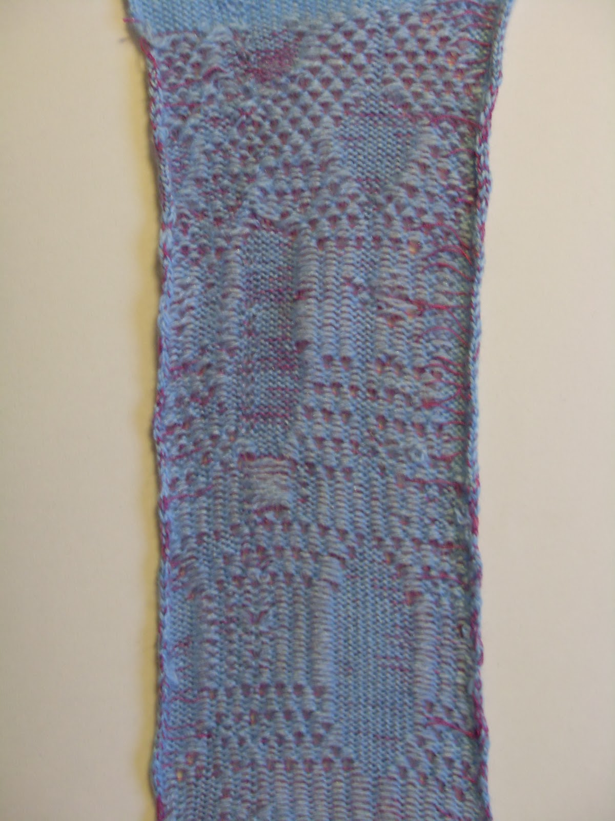
I decided to choose machine knitting as my workshop as I have always enjoyed hand knitting but have never had the chance to work on a machine. I also thought that machine knitting would create a lot of interesting samples as there are so many different techniques and materials I could use. When I was initially starting to learn the different techniques on the machines I chose to use monochromatic colours such as greys, whites and blacks. At first I was interested in the process of lace holes and ladders as they reminded me of the patterns diamonds are set in, so I started experimenting with that. Lace holes:

I then started drawing onto metallic surfaces to emulate jewellery so I wanted to include this in my knitting as well. I started by knitting with wire by hand as I had seen some of Jurgen Eickhoff's jewellery in Manchester Museum, which included knitted sterling silver wire with jewels on. Photo of Jurgen Eickhoff's work with a photo of one of my wire samples:

But I knew I couldn't machine knit with either of the wires that I had used as one was too uncontrollable and the other was too thick and stiff. I also tried hand knitting with other metallic materials such as ribbon, but found they weren't easy to knit with on the machine. I then came across an artist who used gold leaf on top of his knitted garments so I decided this would work best for me. I also introduced coloured yarns into my knitting. I took the colours from the colours in my photoshopped pieces I have done of photos I had taken of pieces of jewellery.


I mixed these colours with the monochrome yarns I was using before and metallic yarns. After a story workshop I found that I have been using circles and circular lines in my work so I decided I would use these in patterns in my knitting. I think this developed my work very effectively and I think also shows what I have learnt about the way I work.
After this I found it quite easy to choose which samples would be developed in my second project. I am doing the photoshop workshop so I thought that I would use a few of my drawings or photograph close ups of my drawings that could be layered up or repeated as I have naturally used layering a lot in my drawings.

I also thought I could create patterns as I started to involve patterns in my knit work.
The only part of this project that I would say is a negative for me is that I didn't get much chance to look at other students sketchbooks and give each other criticism as I think this helps a lot during projects.
Subscribe to:
Posts (Atom)