With the first design I decided not to cut up some larger sections of the photograph so the audience can see the mark making qualities more easily and also helps to distort the scale of the image in contrast to the smaller pieces.

My first design was so disordered that I decided to look back at my photographs of my 3D designs, taking the shapes from them again and creating designs with slight 'glitches' in. I felt like my project was now impelled by architecture because of the 3D and drawn plans I had been working with but transferring my designs onto graph paper made them look too busy and took the attention away from my dark moody photography.


The use of light and dark in my designs works well, but I think the last two designs I created look too ordered, whereas my first design holds an order within the disorder, something I was aiming to create. This is a process I can use in the future when I start to create my print collection.
I wanted to find other ways of creating 'glitches' in my images and was recommended the book 'Uncreative Writing' by Kennith Goldsmith, as there is a section to link Jpeg images and text files to create altered images. I tested this on my ice photographs and inserted text from Edmund Burke's book on the sublime, but new computers won't open up the altered Jpeg image as the computer reads it as corrupt.
Cecile Dachary's media explorations inspired me to create paintings using ice. I was interested in her mixture of painted textures and pin prick marks. I decided to use glitter paper as I thought the reflections off the glitter mixed with the darkness of the black ink would help create a confused and disordered image.

Dachary, C. Painting. Erin Louise. [Online image] [Accessed on 10 October 2013] http://erinlouise.com/2012/06/cecile-dachary/
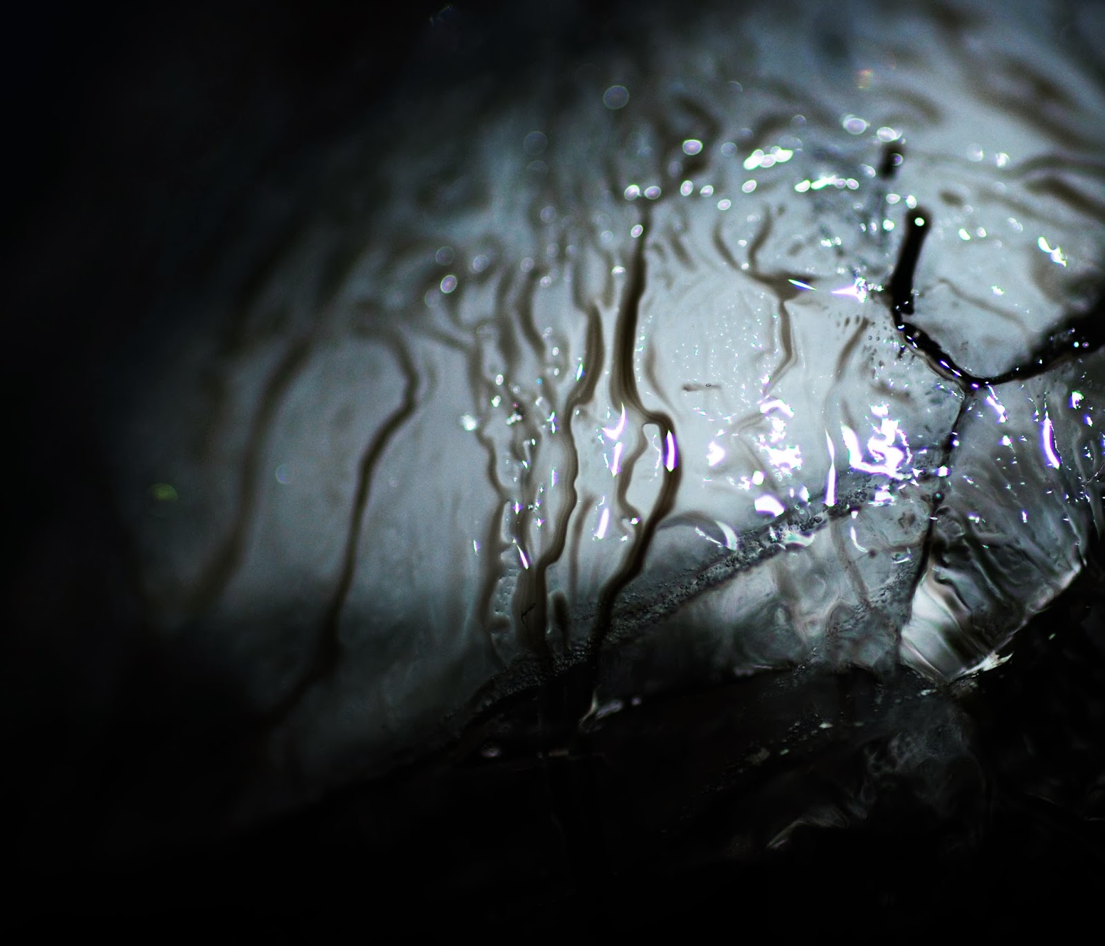


My photography work with ice has worked effectively and creates the dark, confused mood that I want so I will explore this further. I also want to further develop the relationship between my 3D forms and my ice photography by projecting my photographs onto larger scale 3D forms.
No comments:
Post a Comment