Tuesday, 24 December 2013

Live Project- Graham & Brown live brief

As I would like to work for them in the future I organised for one of the designers at Graham & Brown to set me a live brief similar to their job briefs. I was asked to create a new floral design for their Premier collection. I decided to create mood boards to show my ideas in development and to show I take into consideration things such as market trends. I chose to create my colour palette from the set colours used in their Premier collection so my design felt like part of the collection. In the Premier collection I found that they did not have an oriental floral and this is a popular trend for wallpaper so I decided this is what I would create. I presented my work on A3 boards as Paula Taylor the trend and colour specialist at Graham & Brown asked me to.


For my design I decided to use a mixture of Photoshop and Illustrator to get the best qualities out of both as print designers do. The feedback from the designers was very positive. They liked that I presented my moodboards and showed the importance of them as they use these as inspiration around the design studio. They also liked that I chose the qualities for my design and my colour way from within the Premier collection, ensuring that it would feel part of the collection. The suggestions they made for alteration were to thin down some of the branches and discard the s shape which has formed between the branches so they would flow more. I made these alterations and recognise it is now more agreeable as the flowers aren't overpowered by the branches and the eye can follow the pattern better. 

Original design 

 
Final design


Final design in repeat

I have decided to advance this project and continue creating designs which would be appropriate for the Premier collection. It is important to show I can create floral designs within my portfolio as they are a continuous style within wallpaper designs. 

Sunday, 8 December 2013

Stage 9 Analysis

     As a way to link my high end and mid market range I wanted to take the colours from my mixed media photographs to create colour palette options for my mid market range. I was aware that you need a combination of  bright bold colours and more neutral tones. The second or third down would be best suited as they have some vivid colours that compliment the muted colours.


         I decided the mono- printed shapes could be used individually as prints for my mid- end collection as the qualities in them are interesting enough. The mono-prints I have created already cannot be put into repeat so I am creating designs that can be. A lot of mid- end wallpaper designs are created in half drop repeat and I have found that mono-print designs are more suited to that. The first designs I created looked too mechanical so I looked back at the past designs from my high end collection and decided to use some of the shapes from these. This is also another way of linking the two collections.

One of the first designs in repeat

One of the past designs I have taken inspiration from.


One of the final designs ready to be taken into mono- printing.

Monday, 2 December 2013

Stage 8 Analysis

I joined View Bug which is a website for the photography community where you can participate in contests and helps to promote photographers, and gain recognition. I thought this would be a good place to promote myself as a designer, linking it with my Twitter account for people to see both my design work and photography work. Within one day of using the site I was recognised by a photographer, Liza Otrefy from San Diego in America, she gave me an award for superb composition for the photograph below. View my View Bug profile at:  http://www.viewbug.com/member/emmasenior1


     I started a conversation on one of the Linkedin groups 'Freelance Textile Designers', asking what size they would recommend a portfolio to be. I wanted to know from professionals in the industry for when I start to assemble mine. I also wanted to start making more of a contribution to the group as employers take notice of top contributors, this will be important when I start to apply for jobs. I got feedback on my question and am now a top contributor to the group.
     I was emailed by the owner of Feedspot, a social feed reader, as my blog is adding value to Feedspot because it is getting a lot of followers. I decided after hearing this it was important for my profile on my blog to be more professional so I have edited my information giving them the link to my Linkedin account and welcoming any questions about my work.

Monday, 25 November 2013

Stage 7 Analysis

It is important for designers and companies to know what designs will be trending so I have decided to search what print designs will be trending in 2015 for high end companies. I would have to consider how long the collection would take to produce and distribute once designed so targeted 2015. One trend I thought would work well with my photography is print mix as it would show off the nice qualities of texture in my photography but once put into repeat I felt that they needed more elements.


Monday, 18 November 2013

Stage 6 Analysis

Georges Rousse constructs installations through different illusions. I thought this would work well with my idea of taking the shapes from my 3D form photography and layering these over the top of my mixed media photography, adding new elements of colour. These worked effectively in visualisations, but the designs with more structured elements were too mechanical so they will not be part of my high end collection.

Rousse, G, 1986. Virtual Architects. [Online image] [Accessed on 12 November 2013] http://www.georgesrousse.com/english/works-selection/02-virtual-architectures.html


This gave me the idea of creating mono-prints to put over the top of my photographs in the shape of the patterns in my 3D form photography. This became a way of losing control over the outcome of the image as I did when creating my 'glitches' on Justin Windle's website because I apply the ink straight onto the paper. 


     The scale of the mono-print wall murals worked once put into an interior setting but the contrast between the black lines and my photography appears too strong. I did research into companies which create high end wall panels as I felt that my images could also work within other interior settings such as hotels and office spaces. I discovered Maxalot which is a company that helps young digital artists establish and promote themselves, a lot of which create designs for walls. Through this I found Eno Henze who sells his wall panels through the Maxalot website.

The piece below is one of Eno Henze's wall panel designs for sale on Maxalot. 

Henze, E, 2008. Ambushes.[Online image] [Accessed on 12 November 2013] http://enohenze.de/ambush/

     I also became interested in Nhow Berlin Hotel; the whole of it's interior is designed with creativity in mind. It also made me think of creating coordinates to go with my designs as part of my design collections. Both high end and mid- end companies use these so they would work well in both of my collections; I should consider coordinating wallpaper/ wall panels and other objects such cushion covers and curtains. 

Nhow Berlin. Pink living area. [Online image] [Accessed on 16 November 2013] http://www.flickr.com/photos/nh_hoteles/5600515364/

     The image below is from Graham & Brown's website, I thought it was important to do research into coordinates for both high end and mid- end companies. Graham & Brown offer their designs and all coordinates in a collection, in a number of different colours; I must consider this when creating my mid- end design collection. 
     I learnt during my internship with Graham & Brown that wallpaper companies use screen printing as their production process, as it is cheap, fast and they always work to the dimensions 52 by 53 cm. I don't need to work to these dimensions when creating my designs for my high end collection as they will be digitally printed, which means I can work to any scale. This makes the process much more expensive but more suited to my designs as they have a lot of colours in. When mid market wallpaper companies create a design they must separate all the colours before being put onto screen which means the more colours and detail you use, the more complicated the design becomes for testing and production. Therefore my photography would not be able to be used in any of my mid market designs as it would be unsuitable for screen printing. 

Graham & Brown. Desire. [Online image] [Accessed on 15 November 2013] 


Monday, 11 November 2013

Stage 5 Analysis

   I decided to try and develop my idea of combining my drawing with my photographs, the repetition work on ice inspired by Jeffrey Simmons worked very effectively but I felt I needed a guide such as Simmon's rotational devices so I had more control over the image rather than just repetition of lines as I was doing before. I decided to use a compass and spirograph; although the compass paintings were effective I felt the circular shape did not connect with the work I had previously been making and the spirograph images were too floral like and had been used so many times in art already, I need to come up with a more original idea.


      I decided that in my high end collection I would offer wall murals as I think some of my photographs are interesting compositionally on their own. I made visualisations to represent the settings for these which are aimed at my audience of home owners; so I have chosen interior settings which have a colour scheme to match my designs. This is important when companies are selling their designs because they are trying to sell a style to the audience, not just a wall mural design. It is important for me to look back on my past designs and put these into visualisations so the audience could see what scale the prints are in context to a room. 


     I have decided I need to edit my CV and make a creative one that is more appropriate for the jobs I will be applying for. I went to a CV workshop and this was useful in what to write on my CV but I felt I needed to do research into how to design it.  http://www.hongkiat.com/blog/creative-designer-resume-curriculum-vitae/ was very useful for my research.  I feel the design is simple enough for people to clearly understand what I am about.


Monday, 4 November 2013

Stage 4 Analysis

After studying my ice photographs I observed that some had a layout like a landscape, so I decided to use two projectors and layer my photographs to create a landscape view similar to sublime paintings. These worked effectively but were too busy once projected onto the 3D forms. I could use the photos of the two projections taken against the wall when creating my design collection, although the photos didn't look like landscapes because of the detail, they still created striking images.


     I felt that it was important to start creating my design collection so I could use the ideas and samples I had already created and develop these further. I decided that I would make two separate collections as the images and colours in my photography would not suit a mid market range, so these will be used for my high end collection. I will pick certain colours from my photography to create colour ways for my mid market range. I still want the two collections to have elements which are similar, this will be developed when creating the two collections.
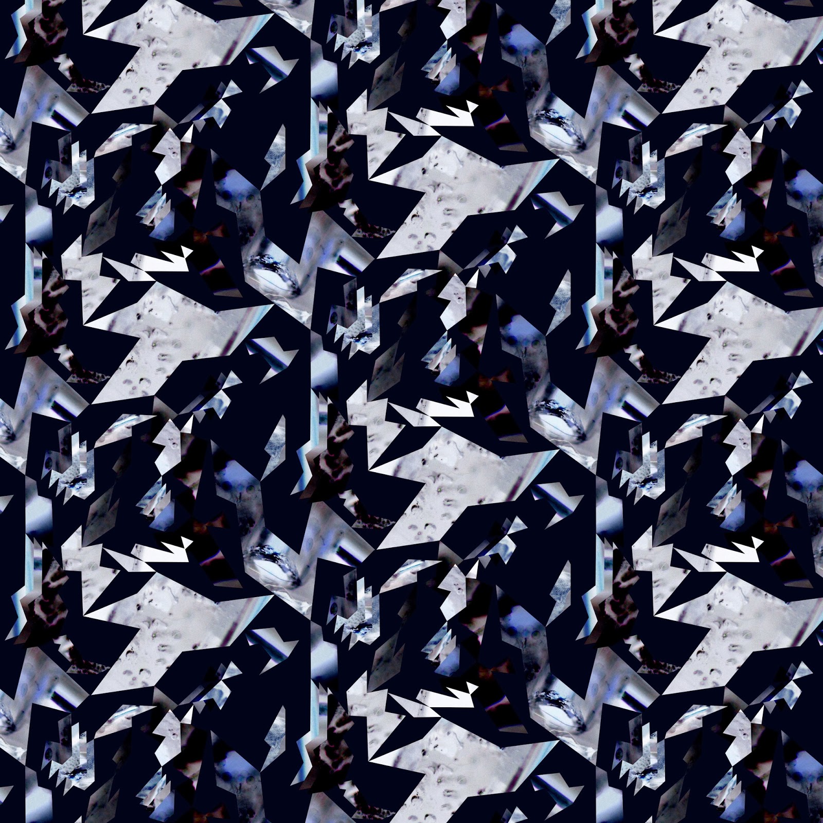
     The first designs I created for my high end collection were inspired by my hand made cut out 'glitches', I used the shapes from the photos to link with the past samples I have created. I used a half drop repeat design as I thought this would create more of a flow to my designs. I was unhappy with my first design as the shapes look mechanical. I decided I needed the shapes to be more uniform as in my hand made cut out 'glitches' so there is some order within the disorder.


     I think my next two designs worked much better and I managed to keep the mood within my designs. 


I decided to take inspiration from Piia Podersalu's design and create mirrored designs as I thought this would work well with my idea of mirroring the ice. These designs are effective and work well with the designs I have done above because the colours and textures complement each other.

Podersalu, P. Tie- dye. Piia Podersalu. [Online image] [Accessed on 03/10/2013] http://www.piiapodersalu.com/Pattern