Friday, 24 August 2012

Cornwall Visit

I visited lots of art galleries while I was in Cornwall, as a lot of the art was inspired by the sea- side I felt like I'd seen a lot of it before, but I also saw a lot of interesting work. At New Craftsman Gallery at St Ives I saw a really interesting sculptural ceramicist called Matthew Chambers, inspired by geometrics, architecture and constructivist art. He layers many sections within each piece of art work which is easy to see. His use of colour also adds other dimensions, helping to creating very dramatic pieces.


Another artist I admired was glass jewellery artist Sally Carver, who sets sea scenes vividly into her work. I also liked her use of colour, texture and movement throughout her work. www.redhotsal.co.uk


Sunday, 22 July 2012

New Designers 2012

I loved going to new designers as you see so many good ideas and designs, its so exciting to see the new and unexplored. One of the pieces that I liked because it worked so well was 'Slap it' created by Joseph Begley. www.jospehbegley.co.uk who try's to push the boundaries between the interaction of humans and objects, using a sense of playfulness and humour. His first piece is some soft plastic buttocks that can be placed on objects around building such as tables of walls, this then tempts the public to go and have a cheeky harmless interaction with the buttocks, giving them a slap, which they then light up, reacting to the humans actions in a positive way. The experience is aimed to make people smile, which when I was around them this seemed to certainly work, people were drew to the light and being able to have this unique tactile pleasure with something which would normally be quite rude to do to a human. I think this is the main reason why is was so successful, is its welcoming you to do something which is normally taboo, its exciting and a little bit nerving for the average person, but you get drawn in by the playfulness of it all.


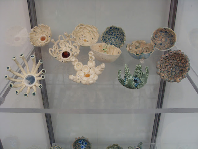
One ceramicist that I saw that I really admired was Angeline Bates, who takes her inspiration from the natural world, which I also do a lot. Her colours were so beautiful and fluid and light and natural. The shapes she used looked so organic and you could see exactly where she took them from, using both glass and ceramics.

A textiles artist that I really admired is Kristal Erga who was exhibiting in the one year on part of the new designers, she has now set up Erga Design www.kristelerga.com. She uses all textile and fashion scraps to create her work as she feels that we now create too much waste and we should recycle more. Her work is a beautiful example of this, using old leather and she also creates her own silk organza. Her designs are for large scale wall pieces, these are attached using magnets on each puzzle plate, so the customer can move the plates around to create their own statement wall piece. I also thought that it would have been good to have all the flowers on small magnets as well so that the customer can also move those around too. 


Another textile artist that I admired was the work of Zhiqiao Zheng, also in the one year on exhibition. She is inspired by technologies in lighting, transformation and colour change, her work is all about natural and man made fibre optics. She weaves metal wires and optic cables into organic and geometric shapes for many genres of art, fashion, accessories, lighting, sculpture and interior design. Every piece looked so gentle and intricate, your eyes are immediately drawn to the light emitting from these pieces. 


Saturday, 21 July 2012

Christian Loubutin- Design Museum

Some of Loubutin's designs were fascinating, clearly not to be worn, but as statements, of power, sex and elegance. His pieces are made to make women feel how they want to feel, made to feel special. I think in fashion this is very important, giving the customer what they want, and making a dream achievable for how they want to appear and feel.


Damien Hirst Exhibit- Tate Modern

One of the pieces at the exhibition that really interested me was Hirst's 'Lullaby, the Seasons' 2002.


The title of the piece links children's lullaby's made to make children fall asleep, with sleep inducing effects of medication. At the same time it also refers to the passing of time and the transient nature of life, due to the way he has positioned the medication. These are themes Hirst often presents in his work. Before I read up on what this piece was about I immediately saw the seasons running through this piece as a theme,  but at a distance the medication looks like semi- precious stones because of the aluminium background, which to the users of the medication they would be very important (like the precious stones) It also made me think of how something shiny has changed the appearance of something so dangerous to something so beautiful. 

Hirst's butterfly pieces were some of the most beautiful works I have ever seen! The colours were so vibrant and as they were on such a large scale they were very overwhelming and filled the room with colour. My favourite piece 'Doorways to the Kingdom of Heaven' 2007 where the butterflies are arranged in complex patterns reminiscent of stained glass church windows, emphasised by the triptych's internal rose- like composition and arch shaped canvases. 


Saturday, 30 June 2012

Dresscode Commission

I participated in a live commission on 23rd June, part of the 'High street 2012 Summer Safari' in Whitechapel, London. High street 2012 was to support and celebrate different arts, heritages and community organisations, trying to improve public spaces in the city and was to part of the London's Great Outdoors programme. I was involved with two artists Jai Redman and Robin Woolston in creating the bicycle- bag sculpture which was inspired by the textiles industry at Whitechapel. I made and designed two bags which were inspired by chintz designs.


I also helped out at the Ideas Store which holds a small gallery on the top floor, which we exhibited a mosaic of our photographs and information of the history of Whitechapel, the public then came in and chose ten of their favourites which I sewed together into a book for them. I was also involved in talking to the public and informing them on the High Street 2012 festival. Other things that I was connected to with the Dresscode commission was the artists were painting two large inflatable domes with textile inspired patterns; and Robin Woolston was using disposed yarns to weave between the trees, in a place called The Waste, she thought it was very fitting that she would be creating her work in a place that the public had disposed of, using materials that the public had disposed of. 


Thursday, 17 May 2012

Summery

I found the model making workshop really useful as it helped me to visualise what kind of work would be produced well in felt. I found that I could take shapes from any area of life and then transfer them into a model which I could then make out of felt. I will definitely continue to produce models as a way of  creating visual research in future, it helped me with my progress in this project immensely. I found that I got my contextual references from a lot of different places so I was very interested in my work as I was keeping it fresh. The special collections was especially useful with this project as it gave me a lot of interesting facts and images to work with. The most useful reference I used in there was a book of bird paintings by Brian Wildsmith, I used one of his paintings for my colour scheme with the rest of my project. Anne Kyyro had a huge influence in my work as her work made me decide that I was also going to use felt and different ways that I could manipulate it. But I found the most useful thing in this project was the group blog, I could get the opinions of other textile students that may not create the same type of work as me or use the same processes but they gave me some really good ideas and were really encouraging when they thought my work was effective.  

Context sheets


This page is to represent my final visualisation and show the details of my pattern and fabric, also showing that I want my pattern to have shapes cut out so you can see through parts, like my masking tape piece on the window. The other photo is to show where my idea of the shape came from.


This sheet is to represent where my initial ideas came from, the use of colour from this painting by Brian Wildsmith which I then hand dyed felt using some of the colours from it. And also the inspiration to use felt and manipulate it like Anne Kyyro Quinn.