Tuesday 19 February 2013

Reworking Paisley and Insect design

I have now tried to rework the paisley and insect design, but I don't think the first designs are very affective as the images aren't bold enough. But after looking back on past designs I have used this pattern again with the same bird pattern in a past design, I think the extra bit of colour in the background print works very affectively.


Visualisations

I have now started to create more visualisations, because I have had more practice I think these have worked more successfully than the ones I did before.


Paisley and Insect pattern complete

Even though all the edges don't add up together I like the obscurity to it and I think the colours work really well together.


Paisley and Insect pattern

I have now started to create a pattern with both paisley and insects together, I have created this into a brush and will layer this up and use different opacities.

Monday 18 February 2013

Visualisations

I have now started to create some visualisations so I can see how my work would look on real scale, I thin they work well large scale so you can see the detail well and the birds are bold.


Layered Colour

I have now tried adding bits of colour to my original piece with different brushes, I like the extra bit of colour but none of the brushes seem to work well with my images, they are all too bold and takes your eye away from the bird images. I then tried to use a large brush with a faded affect on it which I think worked better, I will experiment with this more.


Bird Pattern

I decided to put the birds in a horizontal line instead of vertical to see if it was as affective as the past ones I had done and I think it is. I would now like to try the birds with parts of them coloured in to add more colour like the archive piece.

Friday 15 February 2013

Paisley and Insect design

I have now created a print like my paisley and fruit design as a background, I think this print works just as affectively.


Thursday 14 February 2013

More Visual Research

I have now done some more drawings of birds so I have more of a variation of shape for my next prints. I have now also started drawings insects so I can use these and create a print with the paisley patterns I drew.


The Cutting Edge of Wallpaper

I found this amazing book with cutting edge wallpaper designers I have named but a few in my blog.

William Wegman:
Has collaborated with Man Ray on a number of video and photographic installations. Uses humerus images such as his Weimaraner dogs, which have been exhibited in galleries and published in many books. His first wallpaper print was in the 1990's named 'Activities'  which makes reference to a wholesome New England lifestyle which is comprised of inkblots. 


Wook Kim:
Graphic artist, painter and installation artist. Kim plays with our perception of what is wallpaper, using traditional patterns and motifs and inserting into their midst unexpected animals at odd intervals. The animals seem lost, adrift in the relentless patterning around them. Their stylised features make them seem strange and exotic, innocent intruders in a sea of repetition. Digitally printed as Kim tries to stay away from mass production. 
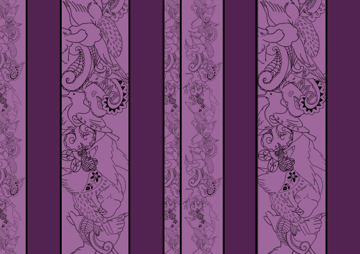


Johanna Basford:
Basford's work is inspired by the wildlife and nature that surrounds her studio in Scotland, using delicate hand- drawings of imagined botanicals, teaming with curious beasts and butterflies are then re- invented into traditional Victorian motifs. The result is a tactile and and intricate print.


Clare Coles:
A merge of collage and embroidery which makes her work totally unique and exciting. Sourcing vintage wallpapers from markets and junk shops, she bypasses the printing process, instead ripping, stitching and embellish them with gems and drawings. Cole has also collaborated with other artists and designers on a number of her projects. In 'Black Blossom and Butterflies' she worked with Kim Robertson who created the graphics and the screen printing, whilst Claire customised the result with stitching and cutting. 


Lene Toni Kjeld:
Focused on the way wallpaper defines a space and has the potential to divide a space. Her paper consists of eight patterns, four main patterns and four hybrids. Her designs morph as they span the room, lace turns into roses. 

Jenny Wilkinson:
Jenny made her name in design with her brilliant 'Wallpaper-by-Numbers' series and has now been heralded as a design classic and is already featured in the permanent collection of the Victoria and Albert Museum in London. The beauty of these wallpapers is that the owner is free to disregard Jenny's colour schemes and create a look to match their particular home and style. They can also leave them blank or half filled in. 


Wednesday 13 February 2013

Colours

I have now started to readjust the colours in my prints as they didn't seem quite right when I looked back and compared them to the colours in the archive piece. I have now started to look at all my prints as a collection, this also urged me to change some of the colours as my pieces didn't blend well together as my colours looked so random and didn't match well.


This is a new design I had created, which is slightly different to another design I had done, this is inspired by 'Chaos and Order' pictured below by Geraldine Peclard. 


Monday 11 February 2013

Colour Scheme

After experimenting with colours from my colour scheme I decided they were too garish and childish to use in interiors, so I decided to fade the colours so they are more subtle. The top row in the image is my original colour scheme and the row below is my new colour scheme.

More Contextual Research

I decided to do more research as yesterdays didn't give me many new ideas. I had already decided to create a paisley print by itself, but this gave me the idea of overlapping my simple line drawings and experimenting with the opacity. I think this will be interesting to experiment with and a much different outcome than the prints I have done before.


This skull image gave me the idea of using my birds as outlines and filling them with my paisley and fruit designs, so I would have no bold black lines in my design. This would also give me a very different outcome than the ones before.

This piece reminded me of bugs because of their armoured plated backs, maybe I could incorporate bugs into my paisley design as birds eat bugs?


Sunday 10 February 2013

New Inspiration

I have decided to do more contextual research to make sure I don't want to run out of ideas, I still have ideas left to try out but I also don't want to feel stuck once I have tried these out. Many of the pieces made me think of just using colour on some of the images of birds, while two others made me think of trying the fruit and paisley print, or bird images in one collected are and then dispersing them out.  

Designer Unknown


Artist Kat Masback

Artist Niko Inko at Street Tattoo.

Artist Hunter Reynolds

Artist Lisa Grue

Artist Angelika Arendt


Saturday 9 February 2013

Breaking up the Pattern

I thought that my last pattern worked quite effectively so I decided to use this to create a new print. I decided to break up my bird and paisley pattern and also changing the proportions of the pattern. I found that I had a lot of capacity to experiment with my colour scheme, after experimenting with colour in my last pattern I found that the red and yellow worked the most effectively so I decided to use these the most with my new pattern. I think this print worked very well. I dislike the mixture of the red and yellow together, but I think when one colour is used in different tones to show the different stripes in the pattern this works very effectively, it is less obvious but still draws your attention to the bird and paisley pattern.