After the presentations in class I started by doing research into a number of the different themes to find out which interested me the most and had the most information for me to work with, I then picked Exploration, focussing on Space specifically.
I started doing contextual research to see what kind of print I would like to produce, taking inspiration from all areas of art as this helps with making my designs innovative. All professional designers pay attention to all aspects of art and the world around them so I think it is important I do. I knew that I would need an idea in my head of what kind of images I would like to use when starting my visual research as some could become useless in the future, and I wanted to become more efficient with my time like a professional designer would; just creating the work that is needed to produce the final design in a limited time.
I decided after my research I would like my work to use lots of layers and a change in tone and opacity between my images, like the work of Betsey Walton and Marcel Wanders.
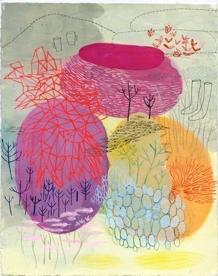
Betsey Walton

Marcel Wanders
I did contextual research into artists/ designers that based their work on space to see how they interpreted it. I decided to put all my contextual and space research on two separate boards on my Pinterest page to make them easier for me to access. Most designers create a folder or mood board for their contextual research but I thought as most of my work is done on the computer it would make it easier for me to access, with a few main research pieces on a mood board in my sketchbook.
The links to my contextual research board and space research board on Pinterest are as follows:
For my colour scheme I created a number of different ones as I knew that design companies do this so they can appeal to their different markets; different places and people like different colours.

Another reason why I picked the theme of space was that I knew it would challenge me, as images of space don't have clear shapes to draw from and I usually pick themes which I know will be easy to create visual research from, whereas space is more shadows. This did make it hard for me to create visual research initially but I found a way of editing the images of space so it was easier to differentiate the shapes. I feel this has impacted on my practice as I will no longer be scared of what kind of images I will be working from, as I know if I am finding it hard I can do this process.

From this I created visual research using a number of different materials and in different sizes, focussing on black and white media as I knew they would be put into Photoshop. I knew Photoshop would be more suited for my visual research as I was using different shades, whereas Illustrator specialises in line drawings and block shapes.

I started to layer some of my images up on Photoshop using colours from my colour scheme to see if my designs would look best with a white/ off white ground or a colour ground. Because there will be so many layers and colour used in my work my designs look best on a colour ground as they sit better in it, they look lost on a white ground.


No comments:
Post a Comment