I decided to create some marble paints as I thought these could mimic some of the textures in space, this worked effectively. I knew that in the past I had not exhausted all my images so I decided to this with my marble paintings, putting them into Photoshop and experimenting with them as much as I could. This worked well also; I will definitely do this in future, exploring each image completely as I got a lot of images out of it. I also found a way of editing my marble paintings so the colours were contrasted and they looked like they were in space, this is my most accomplished work so far in the project, it was a key point in my working progress. I would definitely like to combine these in my final designs with some of my other work.

One image from space that inspired me to do marbling.

These are just some of the images I created from this marble painting.


I decided to layer up my contrasted marble paints as I knew in my final designs I would be using a lot of layers, I think this was effective.

I became interested in images of earth taken from space because of all the different textures; I especially liked the way buildings appeared in large blocks. I found a microscope with a altered lense so when you look through it everything appears in blocks, I took photos of my work through this and it worked effectively. This has made me think about the different ways I could photograph my work in future to create more work, such as a clear kaleidoscope, coloured glass or binoculars. I then edited these and broke them apart like I did the marble paintings.

Photo of buildings taken from space.


The studio visit to Diane Harrsion was very useful and informative, I learnt a lot from it. I found out they use a programme called AVA instead of Photoshop or Illustrator as it makes repeat pattern a lot simpler but is very similar to Photoshop. It was good to know what kind of programmes I would be using if I work in a print design company. They also said that they create different colour schemes for different places, usually different countries, which is what I have done in my work. I also learnt that they create patterns by hand and then put them in repeat digitally; this was very interesting to learn. We saw a lot of mood boards around the studio which looked like mine in my sketchbook, and also the one I created in my group in the first week of the project which gives me confidence as I know I am putting my ideas down professionally. They also look back on past designs that the company has done so that they don't create anything similar and so they can improve on their designs. I need to do this more so I can see what worked well with my past designs and what I can improve on. In their studio they also have lots of their work around them pinned up on walls, this is also how I like to work.


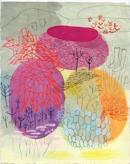
After learning that the designers in Diane Harrison create patterns by hand I decided to try this out myself. I wanted to break apart my contrasting marble paintings using the block shapes like from the microscope and circular shapes taken from space photographs. These worked effectively but needed to be on a colour ground and I couldn't see them working very well with my drawings as they are so ordered, and my drawings have a spontaneous natural feel about them.


I created some layered space images with a combination of my drawings and the edited marble paintings, these were successful and I would like to explore this more. I tried to create a print by breaking up one of these space images into stripes and piecing it back together; but even though the colours were very bright, because the pattern was so small it made it look dark which I don't want.


This is a section of the pattern.