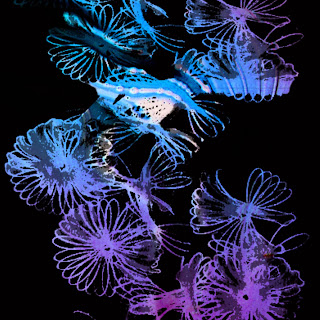
I decided that in my high end collection I would offer wall murals as I think some of my photographs are interesting compositionally on their own. I made visualisations to represent the settings for these which are aimed at my audience of home owners; so I have chosen interior settings which have a colour scheme to match my designs. This is important when companies are selling their designs because they are trying to sell a style to the audience, not just a wall mural design. It is important for me to look back on my past designs and put these into visualisations so the audience could see what scale the prints are in context to a room.
I have decided I need to edit my CV and make a creative one that is more appropriate for the jobs I will be applying for. I went to a CV workshop and this was useful in what to write on my CV but I felt I needed to do research into how to design it. http://www.hongkiat.com/blog/creative-designer-resume-curriculum-vitae/ was very useful for my research. I feel the design is simple enough for people to clearly understand what I am about.


No comments:
Post a Comment