Tuesday, 28 February 2012

Liverpool trip

I saw a lot of interesting work in Liverpool, especially in the Tate, Walker gallery and the Open Eye Gallery. These are just a few of my favourite pieces.


This piece is called 'Mirage' created by Michael Raedecker, from the John Moore prize winners exhibit in the Walker Gallery. I like this piece because of the unexpected use of thread where usually would be paint. I also like his use of murky colours. I also like how he uses his knowledge of embroidery to create different surfaces appearing like shadows and images. 


'Slump/Fear' (Orange/Black) by Alexis Harding was also part of the John Moore prize winners exhibit. I liked this piece because of the bold colours and it wasn't obvious how it had been made. It initially reminded me of what thin fabric goes like when you cover it in glue and leave in to dry in an obscure way. But he actually created it by pouring oil paint onto primed MDF, then while this was still wet, poured over gloss paint through a perforated guttering, creating the grid. He then tilted the board and moved the paint with his fingers to force the two layers against each other. I like the texture he has created with other two layers of paint, it looks really bold. 


I also liked the work of the Martin brothers, how you could clearly see there inspiration of nature in there ceramic work. I like there use of colour and shape, everything inspired by nature. These were in the Walker Gallery.


I also liked this piece 'Cross' by Mary Martin, also in my John Moore prize winners exhibit. I thought her use of material and shape worked really well together, because of the reflection of the shiny surface and the angular shapes, they created other shapes in the reflections. 


These are just some of Philip Treacy's hat blocks. I found these really interesting to look at as I have always admired his work and the unusual forms that he creates.


Saturday, 18 February 2012

Project Evaluation

     I felt quite confident coming into this project as I thought the brief helped my focus. I was happy that we were creating samples as our main process as I find this the most interesting and important part of a project because it is where I learn the most.
     During this project I have become better at evaluating my work and looking at it as a whole so I can find different ways to improve and develop it. I have also become better at experimenting with other media; which would not usually be used in art, creating marks with when drawing. I have also learnt how to produce a colour study with things other than paint, such as yarns or random objects. I would like to continue this in the future.
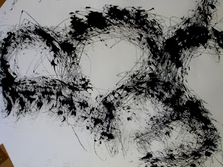
This piece was drawn using the stick from a child's bubble set and a razor dipped in ink and a graphite on the end of a garden stick.

     After the last project I am still trying to improve the amount of drawing I create as I know this helps with my project. When it came to writing my own brief I also created a time table which made things a lot easier as I was more organised. I need to do this in the future to make sure I am doing enough drawing.
     While I was doing the knit workshop I became very interested in experimenting with different materials, including different yarns but also everyday objects such as video tape and foil.
Knitted piece created with foil.

     While doing a story workshop in uni I noticed that a lot of my work included circular shapes, so I decided to incorporate this in my knit work by using circular patterns. This then made it easy for me to write my own brief  as I had become so interested in patterns I decided to focus on them in my photoshop workshop. 
One of my photoshop pieces I created at the beginning of the workshop.

     I felt that in my last project my sketchbook wasn't in a proper sequence, so for this project I decided to stick small sections of work in at a time which I feel has worked more effectively.
     I have really enjoyed both the knit and photoshop workshop, they were both new to me so I learnt a lot. During the photoshop workshop I decided to carry on machine knitting and I dyed my own yarns which worked very effectively. I would like to experiment more with dye in the future. 
This is a photo of my dyed yarns.
     I also felt that photoshop was a good way of drawing, even though it was on the computer I still felt in total control of what I wanted to create, just as I am with a pencil or other drawing tool.
     Different artists/ designers always have influence on my work, but I think the most integral during this project was the work of Timorous Beasties as his wallpaper totally changed the direction of my photoshop work. Before I was creating feminine pieces but after I created quite ominous pieces. I found this more interesting and it was also easier to create work.
Timorous Beasties wallpaper I used for inspiration.

Photoshop piece inspired by Timorous Beasties work.

     The things I would change during this project are that I would have created  a timetable for the first half of the project so I would have been more organised and I would have done more drawing. I would also have liked to experiment more with materials I could have printed my photoshop work onto. But overall I am happy with project as I feel I have learnt a lot and produced some good samples.

.


Butterfly ink prints

For some of my photoshop pieces I had started editing this photo as I love these print designs as they remind me of some of Alexander McQueen's pieces from his spring/ summer 2010 collection which I had admired so much.


I then found the work of Timorous Beasties who is a wallpaper designer, his blue and white piece reminded me of the Rorschach ink blot tests which were used in psychological testing and also of the butterfly printing you were taught to do as a child. I decided to create my own butterfly prints using the same colours from my postcard. Only a few came out effective as it was hard getting the marks to be bold and dark enough but also slightly detailed to make them more interesting. I then decided to scan these into the computer and edit them on photoshop. I again use the same colours from my postcard, sometimes editing them to make the layers look more interesting. I used all my butterfly prints and selected the most detailed layers to combine differently to create different pieces. I found this worked very effectively and was very simple to do.
The piece of wallpaper I was inspired by, created by Timorous Beasties.


One of my butterfly prints I used to work on in photoshop, and some of my photoshop work below.


I like how the unevenness of the paint has created movement in layers in my photoshop pieces. I also tried putting my patterns horizontal but this didn't seem to work as well as I felt that the pattern needed to be more detailed but I didn't have enough pattern layers to create this.


Wednesday, 15 February 2012

Creating materials

In a drawing class we were told to create our own drawing materials using garden poles and attaching objects to the ends to draw with. I chose normal things that you draw with such as graphite to attach to the ends, but also other objects that could be dipped in ink or paint, such as a razor, sponges, toothbrush, a collection of wire to create a large brush and also part of a children's bubble set. I found that the stick part of the bubble set made very interesting marks because of all the ridges. I also liked the movement using the stick created to my pieces as I working a lot more freely. I will use these drawing materials again in the future as well as create some new ones.
This was created by attaching different sized wire to a long stick, dipping it in ink and drawing while it is on the wall.
This was an oil pastel attached to a long stick and drawn on the wall while holding it under my arm.

This was created by dipping the bubble stick in ink and paint and dabbing it on the paper while it was on a table and the wall, I like the texture that this creates.


These were created with a razor, graphite, and the bubble stick dipped in paint.

These were created by dipping a sponge in ink, and drawing with graphite.


Tuesday, 14 February 2012

Experimenting with layers

Now that I have discovered which process is best for me I know how to quickly start new work. I usually start by either using the magic wand or the lasso tools to separate different layers from different images and start layering them up to see which would work well together. I have found that you need a lot of imagery to work from when your using photoshop as you never know what imagery will work well together.
This piece was accidental, the white layer underneath was taken from a pattern on a dress and I wanted the piece to look like the image below, but as I started to rub out some of the flower layer I thought it looked quite nice because of the flow of the image and the intense detail in one space and the rest being bare and clean.
These are two of my favourite pieces because of the warm but calming colours, perfect for interiors in a living room.


First photoshop work

When we first started the classes we were taught how to create brushes using scanned images of our drawings, I found this interesting but it didn't feel like this was an effective way for me to create my patterns, they felt too simple by themselves. One of my photoshop pieces I created using just brushes:

We were then taught how to use existing photos and images of our work and editing certain parts out of them using the lasso tools and the magic wand, so you can transform them by using different style tools to change the colour and appearance of the image; and also to layer different images on top of each other. I found this process quite hard to learn as there are so many different stages you can go through to do these. The next few images are practices of me using different tools: I also wanted to experiment more with the use of colour with these as I had found a book on colour themes; 'Pattern+Palette2 sourcebook' which gives good colour schemes and explains what feelings these give off, which I thought was a good idea as I wanted to focus my designs on interiors.


Monday, 13 February 2012

More knitting

I have now started creating more knitting using tension stripes, ladders and e-wrapping. I decided to use my dyed yarns and other pre-dyed yarns as just using my dyed yarns was hard to knit with as they are so thick. I wanted to introduce other thinner yarns as then I could also do lace pattern knitting. I matched the coloured yarns to the colours in my postcard so I continued my theme. I am happiest with the outcomes of these pieces as I think the colours work well together, and even though they came from the same image because of the way I have chosen to match the colours they each create very different feelings.